- Product development
- 13 Jun 2024
Web design: Trends & inspiration (2024)
Web design involves a mix of art and technology, combining layout, colour schemes, graphics, and content.


Table of contents
Contributors

What is web design?
Simply put, web design means creating visually appealing and functional websites. Web design involves a mix of art and technology, combining layout, colour schemes, graphics, and content to make a website not only look good but also user-friendly.
Now, you might be wondering what it actually implies. Don’t worry, we’re here to show you all the steps, processes, inspirations, and trends that are going to help you better understand the flow of web design.
The process of web design in software development

As in our previous article about mobile app design, the steps are the ones presented in the infographic above.
Research
Before diving into the creative part of web design, you need to do some homework. Research and understand your users, market trends, and the competition. This way, you’ll gather valuable insights that will guide the design process, creating the perfect mobile app for your specific audience.
Wireframing
Wireframing is like sketching your website interface on a blank canvas. It’s where you start to visualise the layout and structure of your website design without getting stalled by the details. Using tools (like Figma) to create a web design wireframe helps in mapping out where everything will go and how users will navigate through your website.
Prototyping
Once you have your wireframes, it’s time to bring them to life with prototyping. Your development team should start creating an initial working model of your website to test its functionality and design. Prototyping basically means developing and launching a version of your website that users can interact with and leave feedback on, as all these will give you and your team a clearer picture of the UX in order to make necessary adjustments before full-scale development.
Testing
Testing goes hand in hand with prototyping; this is where you get to see how well your design holds up in the real world. It involves putting your website prototype through heavier use to identify any issues or areas for improvement. By doing so, you can ensure that your interface design is functional for a large number of users.
Iteration
After testing, you’ll likely find areas that need a little bit of work, so this stage allows you to go back and make those changes, ensuring that your website’s UI design continues to evolve and improve.
Trends in web design 2024
Grab your pen and take some notes—this is what’s hot and happening this year. Here are some of the standout web design trends you should keep an eye on:
- Dark Mode Dominance
Dark Mode is here to stay; it’s easy on the eyes and looks premium. Plus, it helps save battery life on mobile devices, which is a win-win for both users and designers.
- Neumorphism
This trend is about creating a soft, almost 3D effect on blocks, graphics, & so on. Basically, making buttons and cards look like they’re popping off the screen.
- Minimalism with a Twist
Clean, simple designs are still in, but with bold accents. Think bright, contrasting colours, large typography, and white space. It’s about making a statement without overwhelming your website visitors.
- Micro-Interactions
Small animations that provide feedback to your user. These can be as simple as a button changing colour when hovered over or a more complex animation when completing a task. This will definitely be fun for your audience.
- Custom Illustrations
Stock photos are out, and custom illustrations are in. They make every website more personal and unique, helping you stand out and tell your story more effectively.
- Voice User Interface (VUI)
As voice assistants become more popular, integrating voice controls into websites is a growing trend; it’s all about providing users with more ways to interact with your site and making it more accessible for everyone.
- Sustainable Web Design
With the increasing focus on sustainability, websites are being designed to be more energy-efficient. This means you should optimise your images and reduce the use of heavy scripts in order to improve your website’s overall performance.
- Augmented Reality (AR) Features
AR is making its way into web design, allowing users to interact with virtual elements in the real world. This is a growing trend, especially for e-commerce platforms, where users can see how a product looks in their environment before purchasing.
- Inclusive Design
Accessibility and inclusivity are more important than ever. Keep in mind when mapping out the design for your website that it should also be accessible for people with disabilities, which is not just a trend but a necessity.
The best web design inspiration for this year
As mentioned above, it seems like the biggest focus in this decade is the mix between aesthetics & accessibility. So, we dug up some of the most inspiring initiatives in web design from this year (so far, at least).
1. Minimalistic Design
Minimalism is still going strong. Websites like Apple lead the pack with clean lines, ample white space, and a focus on essential elements. The simplicity helps highlight key content and can speed up load times, which is a win-win for both aesthetics and functionality.
2. Bold Typography
Using big, bold typography can make a statement. Check out Spotify for some serious font inspiration. It’s a great way to create a visual hierarchy and guide visitors through your content.
3. 3D Elements and Illustrations
Incorporating 3D elements and custom illustrations can give your website a unique and creative edge. Websites like Stripe use 3D graphics to add depth and interest, making their pages more visually captivating.
4. Asymmetrical Layouts
Breaking away from traditional grid layouts, asymmetrical designs offer a fresh and dynamic way to present content. Sites like Moooi use asymmetrical layouts to create a sense of movement and flow, making the browsing experience more interesting.
Why do these matter?
- These trends are keeping users engaged.
- Usability and accessibility are enhanced.
- All those visual initiatives are definitely helping businesses stay memorable in their audiences’ minds.
Introducing Proteus
Now that we’ve gone over the latest trends and inspirations regarding web design, we’d love to show you what we’ve been working on lately: PROTEUS, our internal solution that’s here to change the way you see web design. Whether you’re an experienced designer or just getting started, PROTEUS is about to become your new best friend.
So, what’s PROTEUS all about? Imagine having a tool that streamlines your entire design process, from the initial brainstorming sessions to the final, polished product. That’s exactly what PROTEUS does. It’s designed to make your life easier, helping you to create stunning, user-friendly designs with minimal effort.
Why PROTEUS Stands Out
- First off, PROTEUS comes with an incredibly intuitive interface. Everything you need is right at your fingertips, all the time, anytime.
- One of the best things about PROTEUS is its flexibility. Whether you prefer starting with templates or building from scratch, PROTEUS adapts to you, not the other way around.
- We believe collaboration is key to any design project, so we integrated that into PROTEUS. It allows for smooth collaboration with your team, making it easy to share ideas, get feedback, and work together in real-time.
- PROTEUS is packed with powerful features that cater to both beginner-level and expert designers. From advanced vector editing tools to colour management and everything in between, it’s got you covered.
- Time is money, and PROTEUS is designed to save you both. Its efficient workflow and powerful automation tools help you complete projects faster without sacrificing quality.
In a nutshell, PROTEUS is more than just a tool—it’s a game-changer for anyone involved in UI and design. It’s built to adapt to your needs, streamline your workflow, and help you produce top-notch designs with ease. So, whether you’re designing your next big app or just tweaking your current website, give PROTEUS a try. Trust us, you won’t look back!
Ready to see PROTEUS in action? Get on the waiting list!
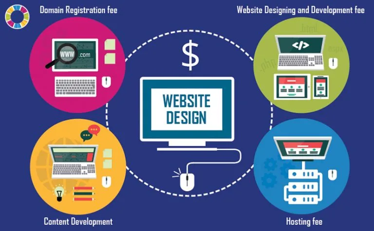
Web design costs
 Source: TemplatesGuider
Investing in professional web design is like buying a great suit. It’s all about first impressions. A well-designed website can help you stand out from your competition, attract and retain customers, and ultimately drive sales. Plus, a professionally designed site ensures that your website is user-friendly, mobile-responsive, and optimised for search engines.
When we’re talking about web design costs, we refer not only to the customisation and combo of text + graphics but also to functionalities, integrations, and even adapting to more devices. For instance, did you know that 61.5% of web traffic in Europe comes from mobile devices? (Statista)
How much does web design cost in the UK?
Specifically, in the UK, web design costs can vary widely. For a small business, expect to pay around £1,000 to £5,000 for a professional-looking site. Medium businesses might look at costs from £5,000 to £20,000, while large enterprises could easily spend upwards of £20,000 to £50,000 for a fully customised, feature-rich site.
How Supply Chain Automation Can Save You Hundreds of Labour-Days and Maximize ROI
HR Workflow Automation: Cut Onboarding Time by 60% While Ensuring Compliance
How to Reduce Financial Close Time by 3 Days with ERP Workflow Automation